5/21/2011
Basic Book Logo Photoshop Tutorial

As an individual, I also like to find unique ways to express myself. Writing, sketching, designing, the list grows as I explore new areas of creativity. Lately, Photoshop has become somewhat of an addiction for me. No matter how much I think I know, I'm always finding new tools and methods to use. Although it's an expensive program, I highly recommend it for any who wish to invest in graphic design.
When I first started out learning Photoshop, I was pretty dang frustrated with how little I was learning on my own. I always had to turn to someone else's tutorials for help. I didn't have a clue about transparent images or the difference between JPEG or PNG. I wanted to be good at it and I wanted to be good at it fast. It would have been awesome if there had been just one spot where I could get a quick, step-by-step guide with pictures on how to do something. So in memory of my younger struggling self, I've decided to occasionally post my own tutorials.
So here it is--a run of the mill, easy to follow, step-by-step guide to creating a scrapbook style book cutout. Similar to the one I have in the corner of my blog.
TUTORIAL
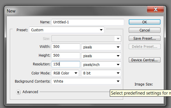
1. First we begin with a new page. Go into File> New> OK. These are my current default settings but you can make them as big or as small as you want.
2. Next we need to create a new layer. You can do this is several ways. Layer>New>Layer>OK or you can hit Shift+Ctrl+N or the easiest method is to simply click new layer in the bottom right hand corner. Double click Layer 1 and rename it books.

3. Now turn to the tools bar. On the bottom left we have the foreground and background colors. Click it and select the color you want your new book logo to be and hit OK. For this particular example I just happen to be using cc99ee for my foreground color.

4. Next select your custom shapes tool. In the top bar you will see the settings for your custom shape. Double check to make sure that Fill pixels is selected, then click on the drop down box and scroll until you find a shape that looks like a book. It can be a simple rectangle, or I prefer to use banner 2 because it gives our book a nice cornered edge. The opacity and the mode should be set to normal.

5. Now using your shapes tool, click and drag to make a book. Voila! You have the first book in your stack. Continue to click and drag, varying the length and width to create a nice little pile. Don’t be afraid to overlap your books, as we’re just going for the silhouette in this tutorial.

6. Now for the apple. I didn’t have a specific apple shape for this, so I improvised. Just in case you mess up, but you don’t want to mar your perfectly shaped stack of books. Create a second layer. Double click and rename layer 2 as Apple to avoid confusion. Make sure you’re working on your new layer and not the old one by clicking once on the new layer. It should be highlighted.
Using your custom shape too scroll down to Hedera 1. Click and drag to create the shape and size of the apple you want. Then erase the top, leaving enough to make the stem. When you’re finished, it should now look similar to this; though, there’s a lot of room for variation depending on how much time you took into getting that hedera into just the right apple shape. If you wish, you can use the brush tool to draw leaves on your apple. It’s up to you.

7. Huzzah! You’re almost finished. At the top menu bar, click on Layer> Merge Down. This should combine both your apple layer and your book layer. Now to give it a scrapbook cutout-like texture, click on Filter>Texture>Texturizer. Set the texture to canvas and then adjust the scaling and bas relief until you get a look that you like in the preview. Hit OK when you’re finished.

8. Now after hitting OK, I realize that the texture looks really good, but it’s coming on too strong. For my blog layout, I wanted something a little more subtle but still cute. To make the texture a little more subtle click on Edit>Fade Texturizer. Drag the opacity down to 50% and hit OK. Note: the fade texturizer only works if the texturizer was the previous step. If you add a new layer or draw with your paint brush, the fade won’t be an option.
9. For the finishing touch, I added a drop shadow to my logo. To do this, I selected the layer and clicked on the blending options. It’s in the same area as the create new layer, but the button looks like an Fx. Select the drop shadow from the menu and a pop up box will appear. From here you can adjust the angle of your drop shadow as well as the opacity and size.

Subscribe to:
Lady Librarian's Blog


0 comments: